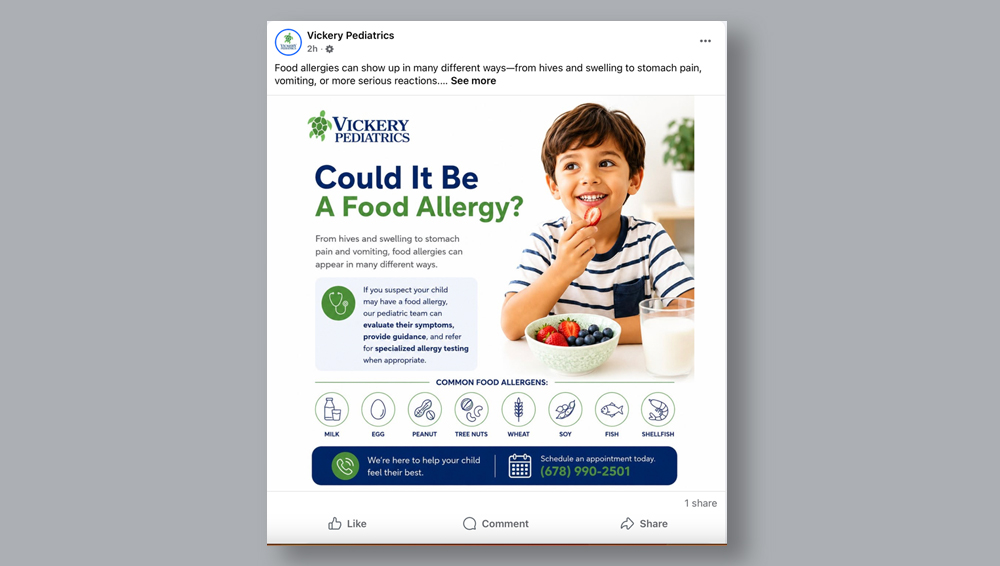
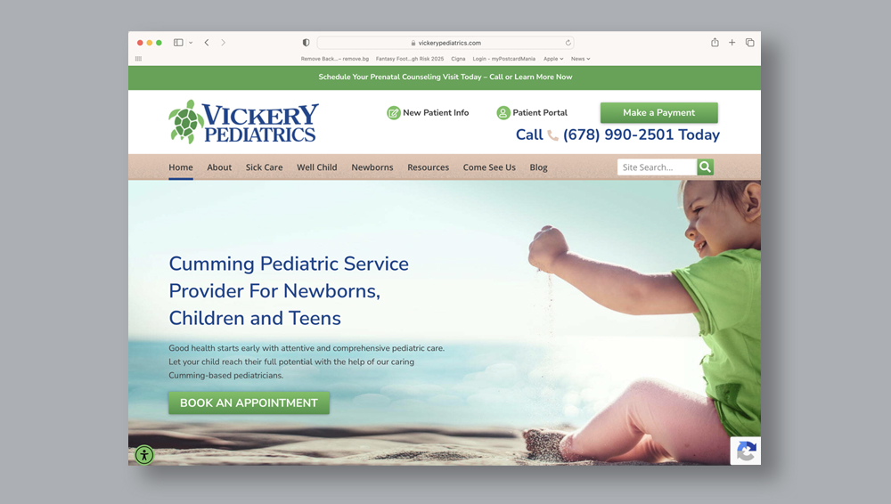
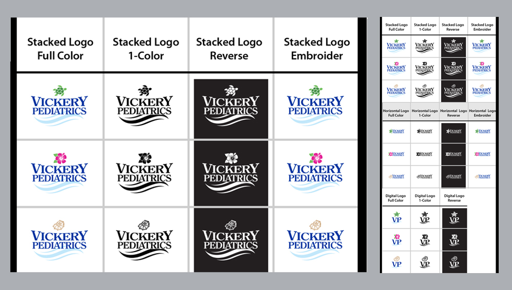
Vickery Pediatrics was looking to update their identity; while keeping the calm energy of the beach and ocean. Starting with a logo and guide to steer their brand’s direction.
Solution
Their past logo was a surfboard with tropical flowers and traditional font with wonky size and spacing. Keeping the calming beach and ocean energy was important, but unifying and making the aethetic more tasteful was key. The use of simple icon, updated colors and fonts and a graphic wave element brought this log and identity where it needed to be.